What is the Font of Your Brand?
- February 16, 2016
- Brand storytelling, Marketing, Public Relations
Even though people notice the visual before the words, the visual rhetoric provided by an attractive typography can increase emotional arousal, and provide better recall. Here, Script Consultants lists out some characteristics of fonts which you should take into consideration when designing your brands’ logo.
- Typeface

Serif fonts, with a line at the end of each stroke, look professional and classic. They imply tradition and heritage, respectability and reliability. These fonts are perceived to be formal, while delicate and beautiful all at once.

Sans serif fonts do not have a line at the end of each stroke, giving off a cleaner and more modern look. They are easy to read and send a message of being straight-forward, reliable and honest.

Script fonts conveys sophistication, elegance and feminism. Some may even suggest luxury. They are generally formal and decorative. However, it may compromise on legibility when it is very reduced in size.

Handwriting fonts are designed to look more human, and the personal touch tend to appear friendly and approachable.

Display or novelty fonts are typically great choices for text-only logos due to their unique and distinctive style. They can be customised especially for a brand.

2. Typestyle
Styles is the concept of coordinated type families consisting of related typefaces. Roman is the upright style, while italic (or oblique) is its slanted cousin.


roman / italic
The weight of a font refers to how bold a typeface looks. A heavy-weight font is bold and strong. A light-weight font is elegant and soft.


heavy-weight font / light-weight font
- Tracking
Tracking refers to the spacing between the characters in a range of text. Tight tracking, with a bold font, can create an impact; loose tracking can portray a modern, sophisticated look.


tight-tracking / loose-tracking
- Scaling
Horizontal scaling refers to how wide or narrow the individual letters are. Vertical scaling refers to how tall or short they are.

The GAP logo has a distinctively tall and narrow scaling.
- Capitalisation
An all-uppercase text feels official and strong, and serves to evoke authority. Traditional capitalisation, where the first letter in every word is capitalised, embodies a traditional and timeless feel. An all-lowercase text can be more casual and friendly.


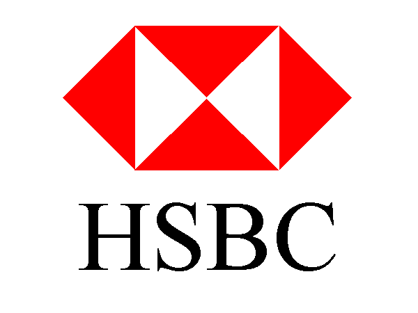
HSBC uses a classic serif font in uppercase letters, which projects a strong, trustworthy identity, whereas Citigroup opts instead for a lowercase sans-serif font, projecting an image that suggests approachability.
Written by: (www.script.com.sg) Edited & Illustrated by: Script Consultants Pte Ltd (Singapore).
http://turnarounddesign.com/what-does-typography-say-about-your-brand/
http://turnarounddesign.com/typography-a-visual-reference/
About us and this blog
We are a digital marketing company with a focus on helping our customers achieve great results across several key areas.
Request a free quote
We offer professional SEO services that help websites increase their organic search score drastically in order to compete for the highest rankings even when it comes to highly competitive keywords.
Subscribe to our newsletter!
More from our blog
See all postsLeave a Comment cancel
This site uses Akismet to reduce spam. Learn how your comment data is processed.


